
THE TREE OF LIFE 保健品系列包裝設(shè)計 | 宏洛圖品牌設(shè)計
Health Supplement Series Packaging Design | Honglotu Brand Design
以色彩為語言,以極簡為美學(xué),打造高辨識度健康產(chǎn)品視覺體系
Using color as the language and minimalism as the aesthetics to create a highly recognizable visual system for health products
一、項目基礎(chǔ)信息|Project Basic Info
客戶品牌|Client Brand:THE TREE OF LIFE
項目品類|Category:高端保健品/膳食補充劑系列包裝設(shè)計
Premium Health Products / Dietary Supplement Series Packaging Design
服務(wù)內(nèi)容|Service:瓶型視覺設(shè)計、全系列產(chǎn)品包裝、品牌視覺體系規(guī)范
Bottle Vision Design, Full Series Product Packaging, Brand Visual System Specification
設(shè)計風(fēng)格|Style:極簡現(xiàn)代風(fēng) / 色彩差異化 / 高端健康風(fēng)
Minimalist Modern / Color Differentiation / Premium Health Style
核心關(guān)鍵詞|Core Keywords:保健品包裝設(shè)計、膳食補充劑包裝、廣州包裝設(shè)計公司、宏洛圖品牌設(shè)計、系列化產(chǎn)品包裝、極簡風(fēng)包裝設(shè)計
Health Supplement Packaging Design, Dietary Supplement Packaging, Guangzhou Packaging Design Company, Honglotu Brand Design, Series Product Packaging, Minimalist Packaging Design
應(yīng)用場景|Application Scenarios:跨境電商、線下藥房、健康品牌專柜
Crossborder Ecommerce, Offline Pharmacies, Health Brand Counters
/case/baojian/2026-03-06/12.html
二、項目背景與設(shè)計需求|Project Background & Design Requirements
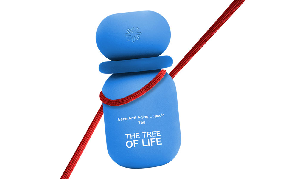
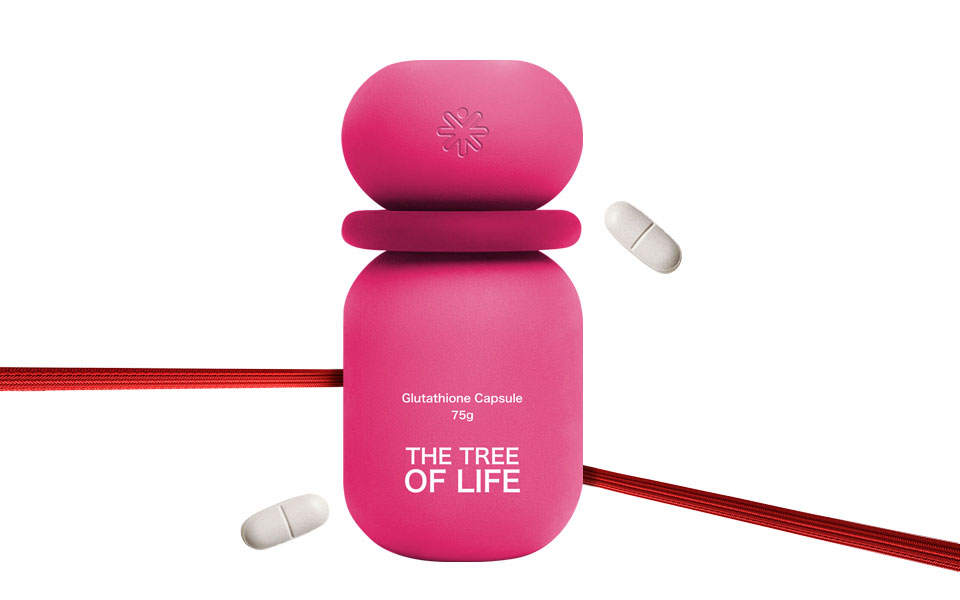
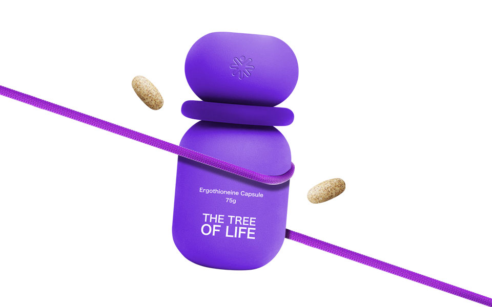
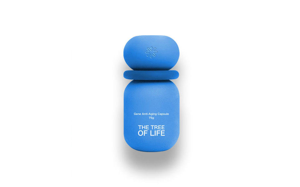
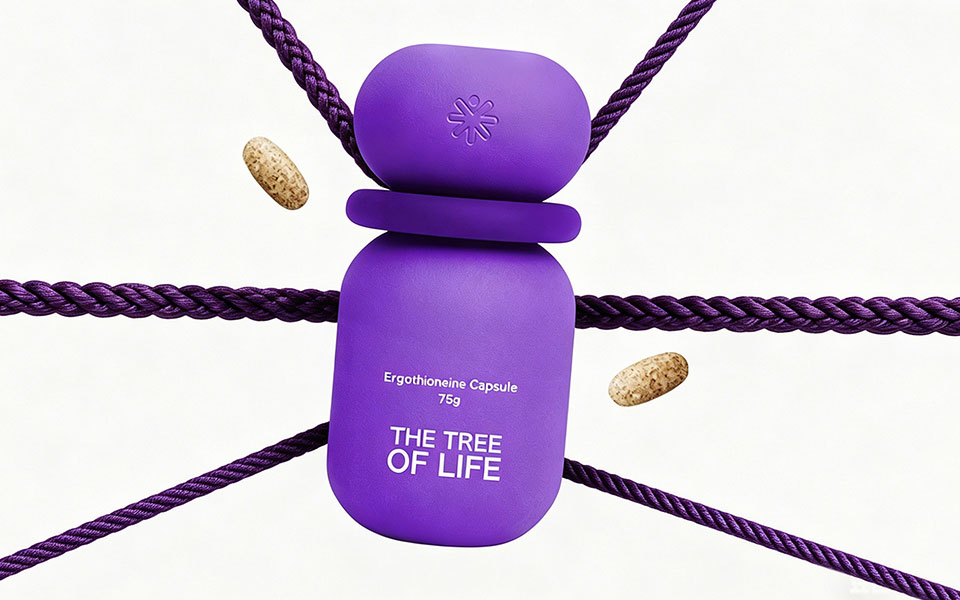
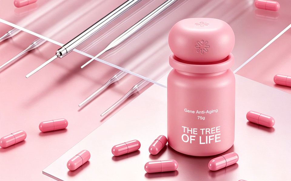
THE TREE OF LIFE是主打基因抗衰、麥角硫因、谷胱甘肽等核心成分的高端健康品牌,面向追求科學(xué)抗衰的高凈值人群。
THE TREE OF LIFE is a highend health brand featuring key ingredients such as gene antiaging, ergothioneine, and glutathione, targeting highnetworth individuals pursuing scientific antiaging solutions.
品牌原有視覺缺乏統(tǒng)一記憶點,無法在同類產(chǎn)品中脫穎而出。本次設(shè)計核心需求:
The original brand vision lacked a unified memory point and failed to stand out among similar products. The core design requirements are:
1. 打造統(tǒng)一且差異化的系列包裝,用色彩區(qū)分不同功效產(chǎn)品
Create unified and differentiated series packaging, using colors to distinguish products with different functions
2. 以極簡設(shè)計傳遞品牌專業(yè)、高端、天然的健康調(diào)性
Convey the brand’s professional, highend, and natural health tone through minimalist design
3. 強化品牌LOGO符號,提升品牌識別度與記憶點
Strengthen the brand LOGO symbol to improve brand recognition and memorability
4. 適配跨境電商、線下陳列多場景,提升貨架競爭力
Adapt to crossborder ecommerce and offline display scenarios to enhance shelf competitiveness
三、設(shè)計理念與核心創(chuàng)意|Design Concept & Core Creativity
宏洛圖以「極簡美學(xué)+色彩戰(zhàn)略」為核心,為品牌打造專屬視覺體系:
Honglotu takes "Minimalist Aesthetics + Color Strategy" as the core to create an exclusive visual system for the brand:
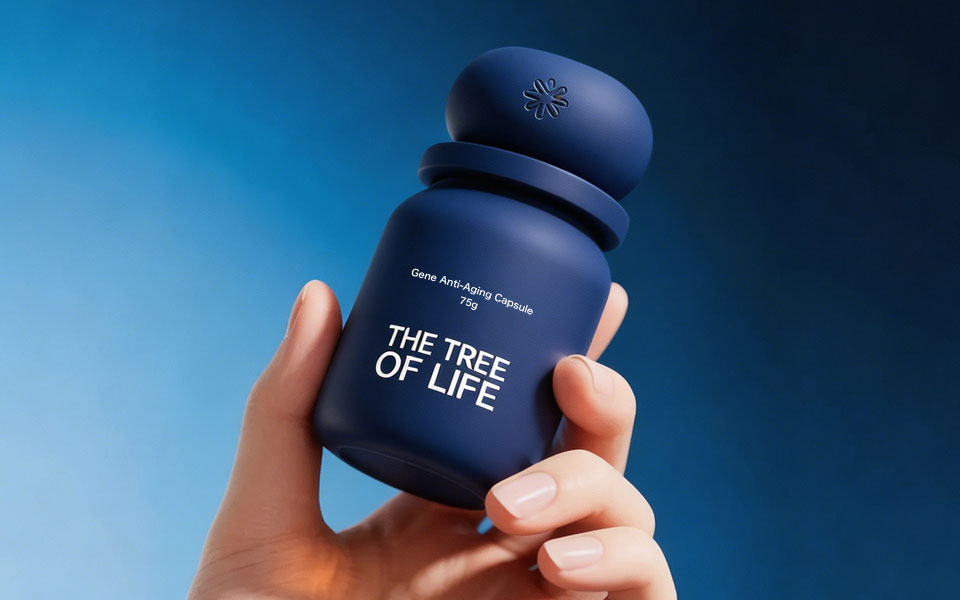
1. 瓶型設(shè)計:采用圓潤膠囊式瓶身,呼應(yīng)產(chǎn)品「膠囊」屬性,手感舒適,視覺辨識度拉滿
Bottle Design: Rounded capsuleshaped bottle, echoing the "capsule" attribute of the product, with comfortable hand feel and strong visual recognition
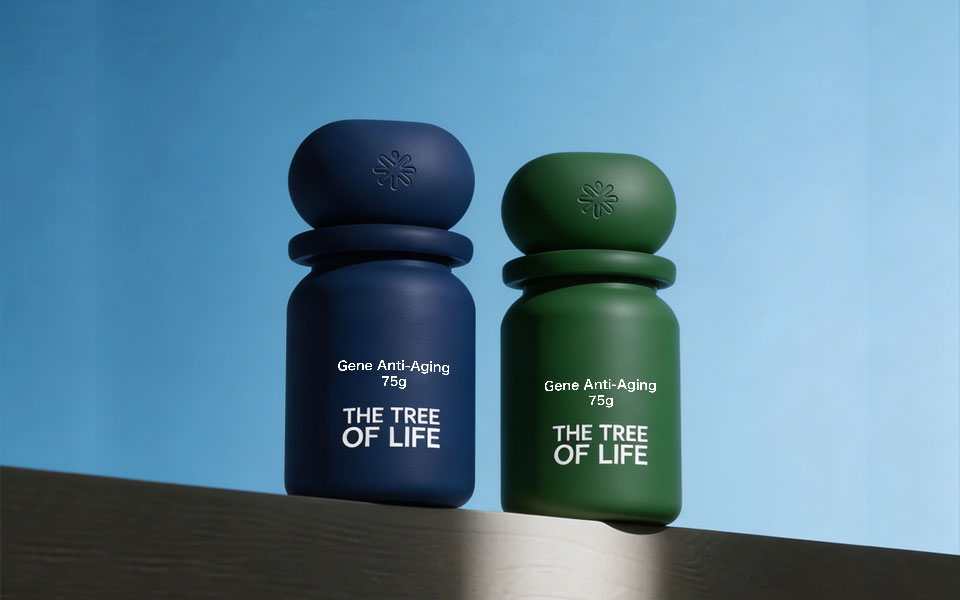
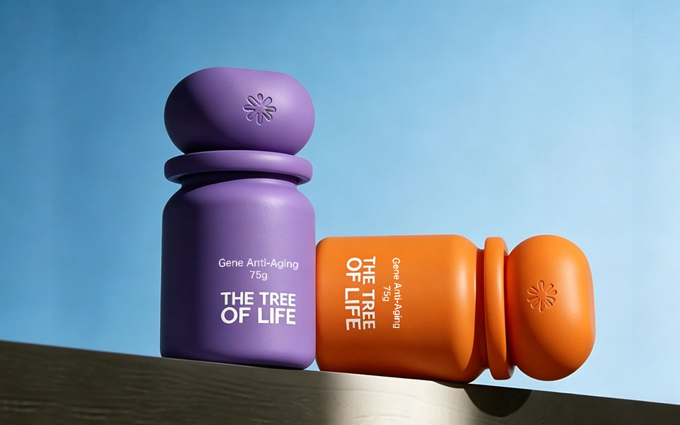
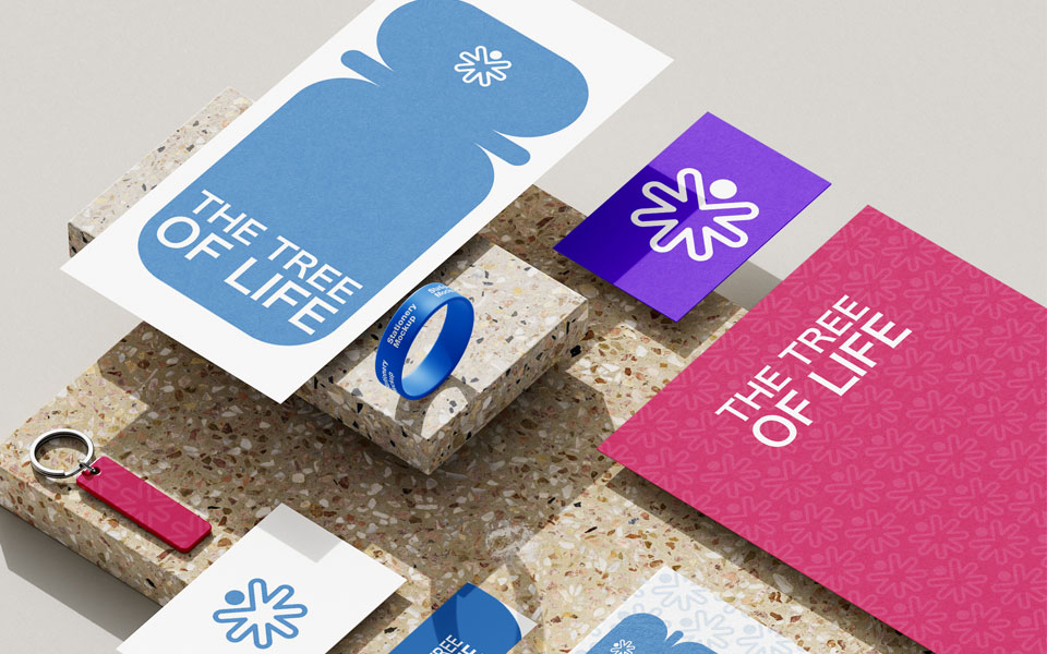
2. 色彩差異化:用高飽和莫蘭迪色系(藍/綠/紫/橙/粉)區(qū)分不同功效產(chǎn)品,實現(xiàn)「一眼識別」
Color Differentiation: Highsaturation Morandi color palette (blue/green/purple/orange/pink) to distinguish products by function for instant recognition
3. 符號強化:瓶蓋壓印專屬生命之花LOGO,強化品牌符號,提升品牌質(zhì)感
Symbol Enhancement: Exclusive Flower of Life LOGO embossed on the bottle cap to strengthen the brand symbol and enhance brand texture
4. 信息極簡:瓶身僅保留核心信息,用留白凸顯高級感,同時突出產(chǎn)品核心成分與賣點
Minimalist Information: Only core information retained on the bottle; white space highlights premium sense while emphasizing key ingredients and selling points
四、設(shè)計亮點|Design Highlights
1. 系列化統(tǒng)一設(shè)計:一套瓶型適配全品類,視覺統(tǒng)一,延展性強
Unified Series Design: One bottle style for all categories, consistent vision, strong extensibility
2. 色彩戰(zhàn)略:用色彩區(qū)分功效,降低消費者選擇成本,提升貨架辨識度
Accurate Color Strategy: Colors differentiate functions, reduce consumer choice cost, and improve shelf recognition
3. 極簡高級感:留白設(shè)計+極簡字體,傳遞高端健康品牌調(diào)性
Minimalist Premium Feel: White space design + minimalist fonts convey a highend health brand temperament
4. 品牌符號強化:專屬LOGO貫穿全系列,打造品牌視覺資產(chǎn)
Brand Symbol Enhancement: Exclusive LOGO runs through the whole series to build brand visual assets
5. 落地性保障:符合生產(chǎn)印刷規(guī)范,支持全品類量產(chǎn)落地
Practical Implementation: Compliant with production and printing standards, supporting mass production of all categories
五、項目總結(jié)|Project Summary
本次THE TREE OF LIFE全系列保健品包裝設(shè)計,宏洛圖品牌設(shè)計以「色彩為差異化,極簡為核心」,為品牌打造了一套專業(yè)、高端、高識別度的包裝體系。
For this fullseries health supplement packaging design of THE TREE OF LIFE, Honglotu Brand Design adopted "color differentiation and minimalism as the core" to create a professional, highend, and highly recognizable packaging system for the brand.
設(shè)計不僅提升了產(chǎn)品的視覺質(zhì)感與市場競爭力,更幫助品牌建立了專屬的視覺資產(chǎn),實現(xiàn)了美學(xué)價值與商業(yè)價值的雙重落地。
The design not only improves the visual texture and market competitiveness of the products, but also helps the brand build exclusive visual assets, achieving the dual realization of aesthetic value and commercial value.
本項目完整案例及更多品牌包裝設(shè)計作品,已同步發(fā)布于宏洛圖品牌設(shè)計官方網(wǎng)站,歡迎查閱更多原創(chuàng)設(shè)計案例。